STELINA VUKAJ
PORTFOLIO
STELINA VUKAJ
PORTFOLIO

App Design
This case study highlights my four-week project designing a mobile app that extends the Hydro Flask brand through digital interaction. By applying color theory aligned with Hydro Flask’s bold and energetic identity, the app blends personalization with wellness tracking, offering users a vibrant and engaging hydration experience.
Hydro Flask
Smart Hydration Meets Personalization: A Wellness-Focused Mobile Experience
BRAND IDENTITY

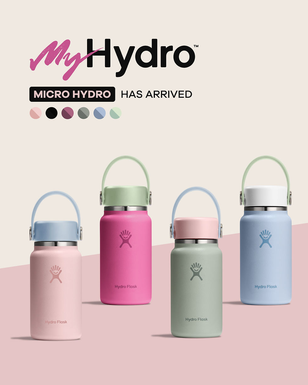
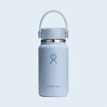
Hydro Flask’s branding, color, and typography play a key role in expressing its vibrant, energetic, and adventurous identity, which resonates with active, health-conscious users. The bold colors and clean, modern typography reinforce the brand’s commitment to self-expression, wellness, and sustainability, making the products instantly recognizable and emotionally engaging.


“Hydro Flask was born out of the need for a better bottle. But it’s about more than just hydration—it’s about creating a product that inspires people to live better and care for the planet.”
I’m researching Hydro Flask’s existing visual branding and design language to ensure my work aligns with their current identity while thoughtfully integrating new features.
Consistent color matching and the repetition of signature hues appear to be key elements of Hydro Flask’s visual identity.
Visual Identity
RESEARCH


Studies show that visual appeal (like bold colors and sleek design) significantly influences purchasing decisions for reusable bottles.
Color variety is a major appeal—Hydro Flask’s vibrant, trendy colors let users express their personality and style.
Color variety is a major appeal—Hydro Flask’s vibrant, trendy colors let users express their personality and style.
Studies show that visual appeal (like bold colors and sleek design) significantly influences purchasing decisions for reusable bottles.
RESEARCH
Low-fidelity


I began this project by creating low-fidelity mockups for three key screens, focusing primarily on visual hierarchy and color exploration.

MID-FIDELITY
I experimented with a variety of color combinations, testing how different shades performed across various button styles and states. This process helped me evaluate visual clarity, contrast, and brand alignment to ensure a consistent and user-friendly interface.


