STELINA VUKAJ
PORTFOLIO
STELINA VUKAJ
PORTFOLIO

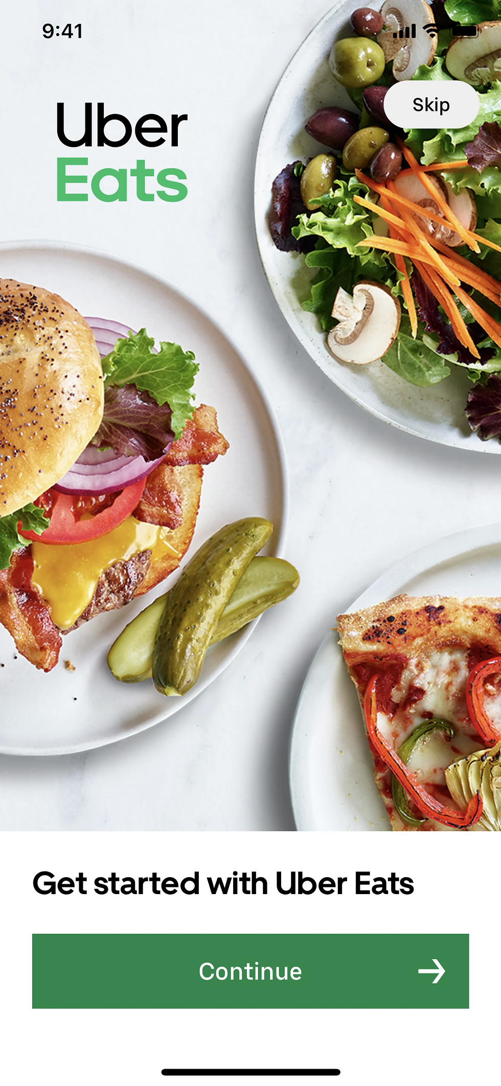


This is my first time using Uber Eats! I usually order from Grubhub.
I forgot to bring my lunch to work—let's order takeout!


I wish you could see the options before creating an account—just like on Grubhub.

The food on the front page looks delicious! I'm excited to order.

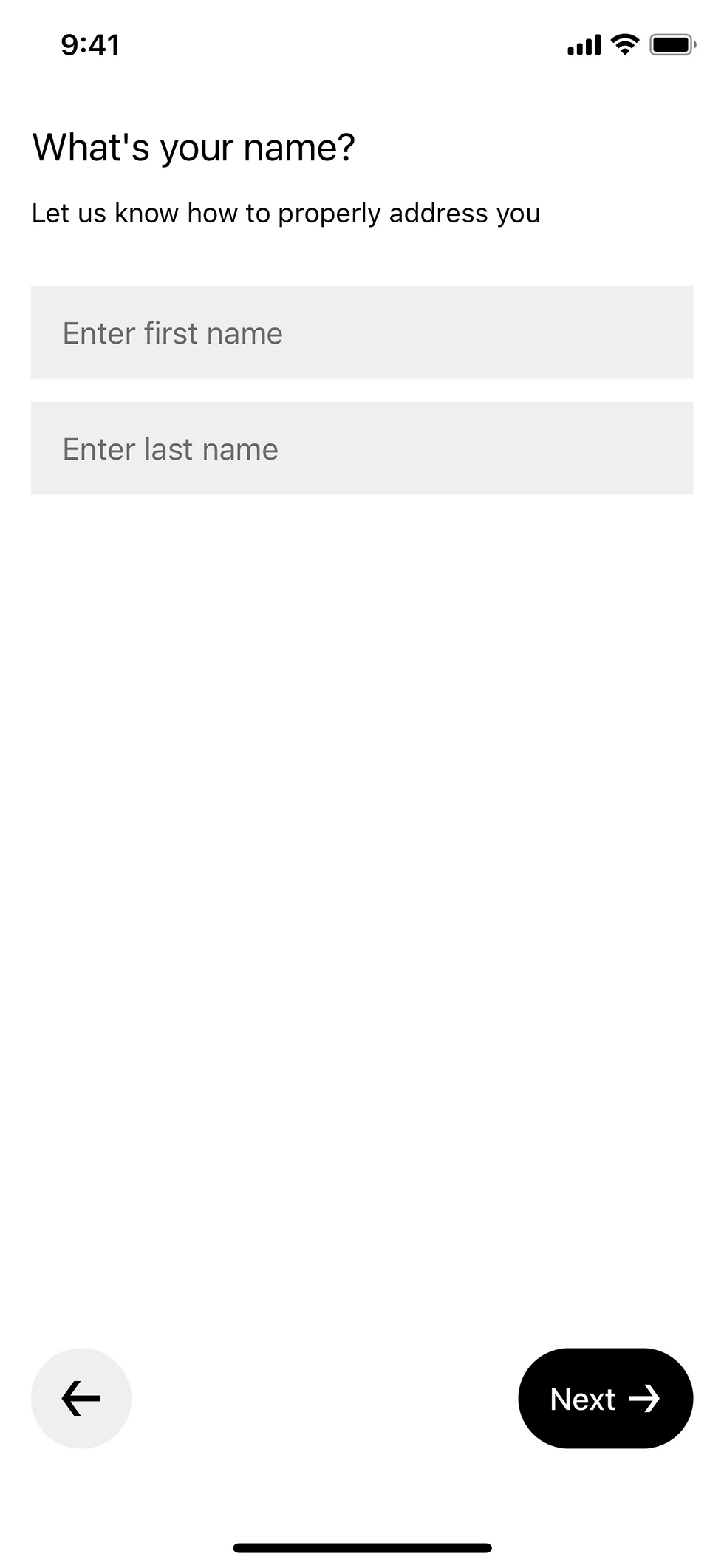
Wow, I really like how simple and familiar this looks. Let's do the manual entry and see how long it takes.


Jakobs law states that users prefer websites and apps that work in the same way as the other sites they already know. This means that if your site or app uses familiar patterns and conventions, users will find it easier to use and be more likely to engage with it.


Let’s start from scratch! I entered my phone number
and received a 4-digit code.


I wish there was a progress bar to indicate
how much I have left.
Let’s fix this!

A progress bar helps users understand
how long it takes to do a task.


Breaking a long process into steps with a visual indicator reduces cognitive load and makes the process feel manageable.

Now, we create a password!


Users should always know their progress. The real-time feedback (e.g., ❌ or ✅) informs them whether their password meets security requirements.

Wait, this is taking too long. I should have signed up with apple pay!
Yayy it looks like we are done! lets order some food!


Wait... How long will this take!


One of the fundamental principles of design is symmetry, which holds immense significance in creating a sense of balance, harmony, and order in your compositions. Symmetry is grounded in our psychology and the natural inclination to seek harmony in ourselves and our environment.

Good use of balance and symmetry.
Lets enter the address and order some food! Wow, this is efficient they automatically fill in my address.


Postel's law, also known as the Robustness Principle, states that in network communication, protocols should be designed to be liberal in what they accept and conservative in what they send.

Using the whole screen for an emphasis works best, it
makes the user interact with it more.
Emphasis is what designers use to draw the eye of the reader to specific elements. You can use this principle not just to call attention to important material, but to ensure the visuals follow other design principles, like hierarchy, balance and proportion.


Finally, we can look for a food! Two things work well on this page proximity and Fitt’s law.
Fitt’s Law states that the size and distance of interface elements affect how easily users can interact with them. By making frequently used elements larger and easier to click, designers can improve usability and speed up user tasks.
Elements placed close together are perceived as related while those farther apart are seen as separate.


It’s nice not having to many options at once, I know I get overwhelmed
Hick’s law states that the time it takes for a person to make a decision is directly proportional to the number of choices they have. In other words, the more options a person is presented with, the longer it will take them to make a decision.


Uber Eats and Grubhub group restaurants similarly, but Grubhub displays them in individual cards.
Sometimes the like button is hidden, so I added
a backdrop.
Miller’s law was followed really well here, I get frustrated with menu’s having to much information at once.


Miller’s law states that the human brain can hold around seven pieces of information in its short-term memory at a time. This means that people can only effectively process a limited amount of information at once before becoming overwhelmed.

Users may feel overwhelmed when presented with too many choices at once, leading to decision fatigue and frustration.
This page could be better, there is to many options at once, not enough pictures


Cognitive Overload

The McFlurry is the focal point because of how it stands out.


The focal point principle means making one element stand out on a screen to help users quickly understand what they should focus on or do next.
Let's place our order! I appreciate how it confirms that I have one Oreo McFlurry.
Everything looks good! Lets click next!


By following Figure ground principle, it makes a cleaner flow for the user.

The figure-ground principle is the concept of distinguishing the main content or message (figure) from the background (ground) to enhance the user's perception and understanding of the interface.


White space is the space between text, images, buttons and other objects that a user can see on a page or a screen.

Using space can make the app more
user-friendly.


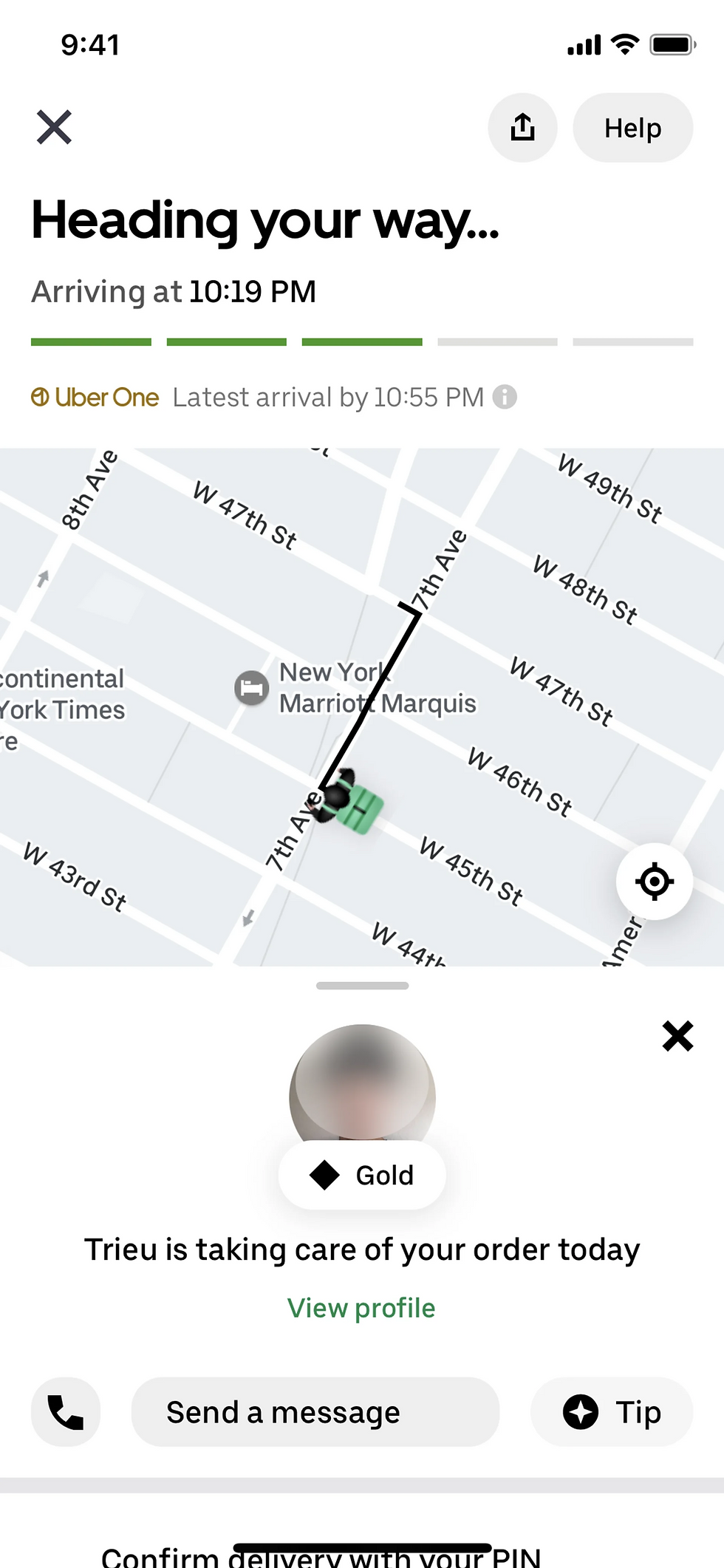
Now they decide to use a progress bar.
Food is on the way!